Are you planning your online success through an engaging and informative E-Commerce Website?
If yes, then you have landed on the correct URL!
When taking your business online, having an interactive, mobile-friendly, and elaborate E-Commerce website is a must!
In this dynamically changing marketplace with variants of products, services, consumers, technologies, etc, every person is choosing Online Shopping over visiting a traditional brick & mortar shop, thus generating enormous popularity for E-Commerce Websites in the last few decades.
With massive traffic and an enormous number of shoppers engaging with your products and website frequently, the user’s experience on your website plays a significant role in generating revenues for your business.
Advancements in the technology, increased awareness in consumers clubbed with influencers and service/product experts, calls for greater features, more efficient elements, and detailed website content/information.
Forbes mentioned these statistics on its portal:
“E-Commerce sales are expected to grow by 10.4% in 2023”
This indicates the severity of competition in the market, making you realize that It’s time for you to gear up and work on these effective elements to make your E-Commerce brand, stand out in terms of unparalleled ease of navigating, checkout, hassle-free shipping & returns along with genuine reviews and elaborated product views and descriptions.
Elements for an E-Commerce Website
1. User-Friendly Navigation
To make the website, aesthetically pleasing, the majority of developers and businesses overlook the element of “ease of use and navigation”. A website should not complicate the moving ahead process for the user. A confusing interface and complex navigation setup can cause major bounces from the website.
To ensure ease of navigation, exponentially increase the number of visitors on your website, reduce the bounce rate and drive higher user experience, necessarily include the following on your website:
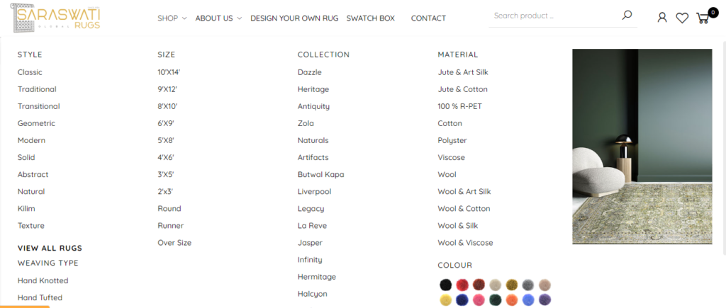
A prominent navigation bar is placed on the top of the website, containing the menu. This navigation bar is a must to give users ease of navigation, visit any page of the website & reach the product or service they are looking for.
This helps in retaining the users to the website as they can find what they desire and can further browse to several other ranges of products thus driving engagement and reducing the bounce rates.
Bread Crumb:
For any business with several levels and various lines of products following an organized hierarchy, breadcrumb navigation proves to be useful.
Likewise, an E-Commerce Website being highly descriptive and detailed is made easy to navigate by the use of breadcrumb.
The inclusion of breadcrumbs improves website accessibility and helps users in getting an idea about their position on the webpage and website hierarchy. Breadcrumb leads to a reduction in the number of steps, a user has to take for reaching a high-level page. It helps the user find the product he is looking for, with ultimate ease.
Breadcrumbs are mainly of 3 types:
– Location-based
– Attribute-based
– Path-based
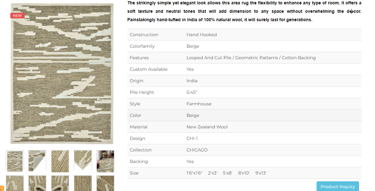
2. Elaborated Product Descriptions & Product Collections
Unlike physical stores, Online purchase delivers a setback of lack of physical touch & personal examination by the customers. Therefore, to ensure your E-Commerce success, an elaborated Product Description is a must, to win over the trust, quality expectations, health & other important factors of purchase, that a consumer finds significant.
Zoom Feature should be incorporated in the E-Commerce website, specifically in the clothing, rugs, electronics, or fabric & quality-related industries, as it gives an edge to the customers in deciding upon the quality, fabric, texture, and ease of access before concluding their purchase.
Add top-notch images on your website that are relevant, prominent, and don’t get blurred when zoomed in!
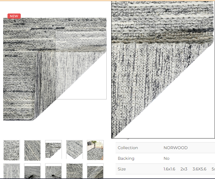
Product Descriptions are one of the most significant factors of a product, for it showcases the ingredient, components, content, size, color, usage, directions, benefits, etc., of the product.
Thus, the usage of high-quality, professional, and accurate images emerges as the need of an hour to ensure a good shopping experience for consumers.
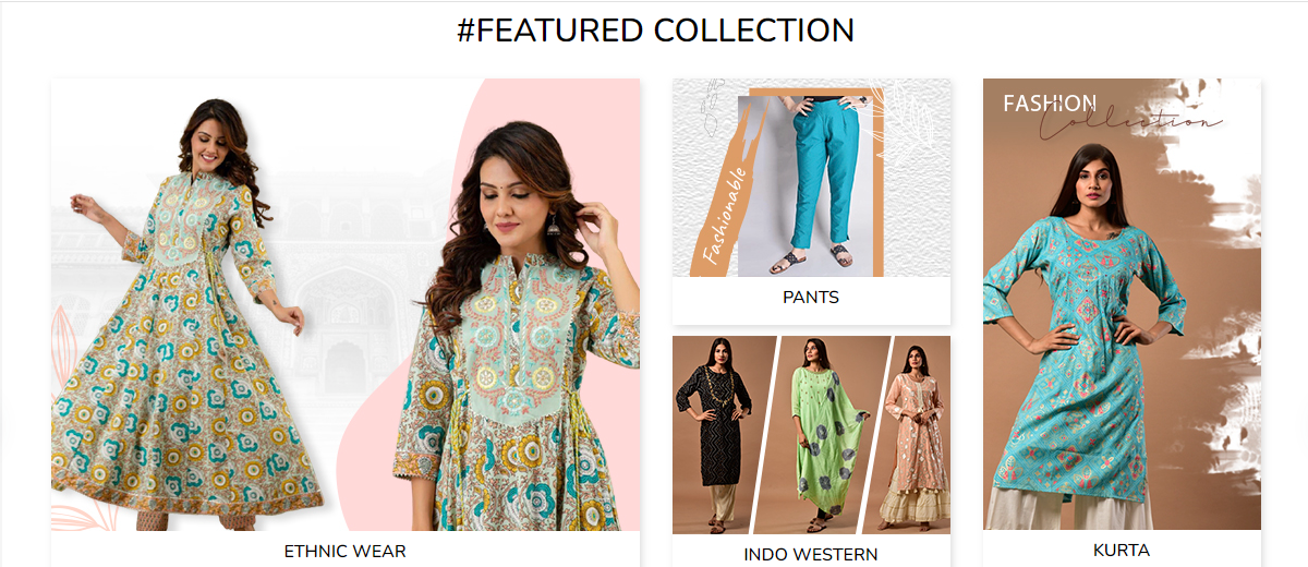
Product Collections are basically the segregation of a wide range of products into categories that could be based on season, sales & discounts, festivals, new arrivals, and likewise. Dealers with large product catalogs can have enormous benefits from Product Collection as it’s a really good source of catering to the specific needs of your consumers, reducing their search time & offering them just what they need with ultimate ease.
The catch here is, Product Collections can be optimized for SEO to rank higher on SERPs, serving the essential business goal of greater visibility & awareness of the brand.
Although, constant updating of the products in the collections should be done because consumers are looking for a new collection, every time!
3. Product Recommendations & Displaying Bestseller Products
Being an E-Commerce Website with diversified product segments & large product catalog, it’s very important to get the focus of users visiting the website on the products that they are looking for!
Recommending products that the user is more likely to buy, will not only engage them on the website and make sales but will also give them a greater user experience which will excite them to visit the website over & over again.
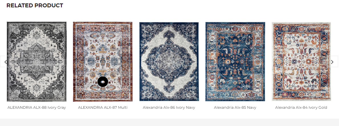
Identifying the most in-trend & highly purchased products of the website and getting them in front of users as a collection, will increase the user’s probability to purchase it. It’s observed that such a category is the most viewed. Therefore, displaying Best Sellers is yet another effective element of a healthy & successful E-Commerce Website.

4. Ratings & Reviews (Text, Video & Recommendations)
An E-Commerce website is very different from a normal website as we all know. On a normal website, a customer glances and reviews the website and moves on with an opinion about the company, services, products, etc. But, in the case of an E-Commerce Website, it’s not just the customers who are involved, there are sellers, and brands and it’s more like a community where people are sharing their views about the product, and their experience with it, further recommending some really good products.
Since, people on this website, make conversions and actual purchases, depicting serious consumer behavior, to engage in a serious purchase cycle, customers must be rest assured about the product/service they are investing in. When a person is viewing a product and making his purchase decision, he is skeptical about his decision. At this stage, the validation of the quality of the product/service is provided by ratings/reviews. It is observed that reviews on a product drive more traffic to its sales.
If good reviews can get you increased trust and sales, bad reviews can lead to damaging your product(s)/company(s) reputation.
Ratings & Reviews are of significant importance for an E-Commerce website, so to ensure that they are posted by the consumers, on the website, we can do the following:
• Asking them for a review via a feedback email
• Offering some offers, discounts, or any sort of incentives to customers for posting a review
Reviews should be posted at a place, which is easily accessible for customers to come and read them, to ensure maximum conversions!
5. Compelling Calls-to-Action
Calls-to-Action are one of the prominent elements of an E-Commerce Website. They narrate the path or demonstrate the action, a consumer has to take, for instance – Purchasing a Product, identifying more information about the product, subscribing to a newsletter or downloading an e-book.
Calls-to-Action are most likely to increase the conversion rates on E-Commerce Websites as it compels the visitors to take the action of the purchase at various steps of the consumer purchasing path. Also, after visiting the website, CTA makes the desired actions easy for the customers which contributes to improved user experience.
To make Calls- to-Action more compelling and alarming following must be taken care of:
1. Action-Oriented Language: Use action-generating words like “Buy Now”, “Sign Up”, and “Get Started”.
2. Urgency: Usage of text that create urgency like “Limited Time Offer”, “Don’t miss out”, “Last Chance” etc
3. Appearance: Making a “stand out appearance” of Calls-to-Action with the usage of contrasting colors with big & bold fonts etc
4. Placement: Placing the CTA’s on the Product page and pages increase its visibility, it’s more visible which increases the chances of consumers taking the desired action.
6. Product Offers/ Discounts On Target Pages:
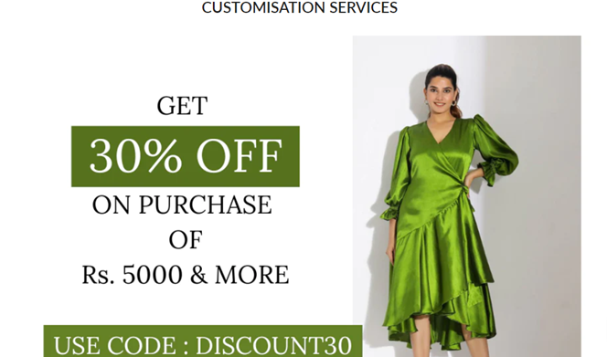
Offering Discounts or Offers on products is the most proven and successful method in generating sales as it creates a sense of profit in the minds of consumers and escalates their purchasing process with the fear of losing the opportunity to pay less.
Discounts/Offers/Promotions contribute to higher conversion rates, drives higher traffic to your website, and also create high awareness for new products, newly established brands, etc. When a consumer lands on your E-Commerce Website, if he is matched by the discounts & promotions banner, while exploring he will also be interacted with other ranges of products thus creating awareness for those products as well.
To ensure proper utilization of this sale-generating tool- Discounts/Offers, ensure the following on your E-Commerce Website:
1. Placement: Place the banners on the home page to make the visitors aware of the discounts/offers, furthermore placing them on the target pages where we want to drive more sales, awareness, and traffic.
2. Products: Identify the products that you want to drive awareness to. It could be either product or category pages, we just need to make sure that the discounts are placed on such products which are not just what we want to promote but also, add value to the consumers.
3. Appearance: Making the discounts/offers visually appealing, mentioning them with the use of high graphics, and bold and highlighted text to drive attention towards it.
7. Quick Checkout Process – Varied Payment Options (CC/EMI/DC/COD)
When a consumer is in the last stage of the funnel, he has made up his mind and is looking ahead to make a purchase. The complicated checkout process could be a nightmare for E-Commerce sellers though, as it is seen that consumers drop out from the checkout process and don’t make the purchase at all if they find complexities or a lot of hindrances while checking out.
The platform should be smooth enough for consumers to make a purchase even when they have limited time in hand. Nobody likes to spend hours on a payment portal trying to make a payment, furthermore, it also puts the genuineness of the brand, seller, or E-Commerce Owner in question.
The payment interface should be designed in a manner, that allows smooth and swift transaction flow, ease of understanding, and ease of payment even when they don’t have an account on the website. This will lead to an increase in the customer retention rate & reduction in the cart abandonment rate. Make sure that placement of checkout buttons is done in a structured and highly visible manner. Placing checkout buttons prominently and at various places increases the chances of conversions.
Infusing varied payment options are the best way to cover a huge spectrum of audience. Options of Credit Cards, Debit Cards, Net Banking, Wallet, COD, and EMI if accommodated under one E-Commerce platform, can increase the chances of consumers making higher purchases, revisiting the portal to repurchase, and developing a relationship with the brand as it provides them with the flexibility to choose the mode of payment and ease of checkout.
Just ensure an elaborated description of modes of payment before the final checkout page, so a person can rest assured and engaged while purchasing without being ambiguous.
8. Specific Product Search Feature
An E-Commerce website usually has an enormous list of inventories/products with a variety of attributes, product variations, specifications, etc. Consumers, while on the website, can get lost between varied product ranges and segmentations.
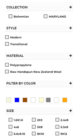
With this as a problem statement, If an E-Commerce website has a specific search feature, consumers will be able to view the specific product they are looking for, and they will interact with several other ranges of products available in the form of recommendations appearing while searching, and will also be assisted in filtering out the product attributes to precisely look for their specific need.
The search feature should be located at the top of the page so that it’s explicitly visible and is not hidden from the consumers. It should also have advanced search features wherein a person can filter the products by brand, color, size, gender, category, usage, availability, shipping & delivery details, etc.
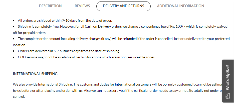
9. Shipping & Return Information
When consumers are buying a product online, they are concerned about several factors. The cost of shipping and the ability to get a product exchanged are two major factors among these.
With online mode, not being able to suffice the need to check, try & feel the product, the fear of not liking the product or product being differently perceived by a consumer, keeps pertaining. The option of return thus, gives a sense of relief to the consumers that they will be returned every penny of theirs if they didn’t like the product they received.
Therefore, the following information must be mentioned on the E-Commerce Website relating to shipping:
1. Shipping Options: Standard, International Shipping, Fast Delivery, etc
2. Expected Delivery Time: Date of delivery in consideration of holidays and other possible delays
3. Shipping Costs: State the shipping cost for international shipping, domestic shipping, etc.
4. Tracking Information: Accurate Order tracking option for a consumer to be aware of the delivery status.
5. Shipping Restrictions: Mention the delivery restrictions, if any, like deliveries to specific countries, regions, cities, etc.
6. Return Policy: Stating the return policy clearly, mentioning the Time frame of Return, Free/Paid Return,
7. Return Process: Elaborating the process of return, so that a customer knows how to initiate the return and finds it easy and reliable.
8. Refund Options: Refund will be initiated to which mode – Store credit/Bank Account/Source Location.
9. Return Restrictions: Mentioning items that are not eligible for return, or any other place, time, or product restriction.
10. Return Shipping Cost: Mentioning the bearer of return shipping cost, explicitly on the website.
With clarity in return & shipping policies, consumers can trust the brand more. Escalations in conversions can be achieved with this shipping & return details component.
10. Customer Support
While catering to people with specified products/services, arising queries, consultations, issues, concerns, etc are inevitable.
The element of Customer Support plays a very crucial role in customer satisfaction and in the success of an E-Commerce Website. While drafting a support service and incorporating it within an E-Commerce Website, some factors should be taken into consideration:
- Contact Information:
The customers must be able to find information to establish contact with you. This could be done by placing all your business-relevant contact details on the website in the “Contact Us” section. The information of contacts like email id, phone number, and physical address can also be displayed explicitly in the footer of the website.
- Live Chat:
Providing an option of Live chat is very beneficial, as it helps in providing real-time assistance to the customers, eliminating the waiting period of getting a call-back or revert of a mail. This improves customer experience as it helps them get quick recommendations and resolve all their issues quickly.
- Help Center:
The help center is the most common customer support tool, which provides answers to commonly asked questions, troubleshooting guides, and other important steps and tools for easy navigation of the website. Try and make, one entirely dedicated help center page, which is simple and easily walkable.
- FAQs:
The well-crafted FAQ section can perfectly answer the common questions that customers are likely to ask. This helps in many ways – Saves time as answers to basic questions are available right there, with no involvement of a customer support assistant, thereby reducing the customer service requests.
Generating Maximum Sales
Considering, the above-mentioned detailed list of effective elements for an E-Commerce Website, the inclusion of these and several other major/minor elements can lead to a user-friendly website, provides ease of navigation, and generates a satisfied user experience.
When a website is seamless to scan and run through, it invites brand loyalty. People choose this seamless experience million times which leads to sales maximization. Complicated hierarchy and complex navigation can lead to dropouts no matter how much quality a product perceives.
So, to maximize sales on your E-Commerce Website, explicitly include these elements to provide complete support to the visitor at each step. Making their shopping experience enjoyable and exciting will generate tons of sales and ultimate success for the E-Commerce Website.
What Should We Do Then?
E-Commerce Websites are the Digital Marketplace with the highest traffic visiting and re-visiting E-Commerce Websites across the globe, to stand out and make the consumers choose your brand for their purchase, it’s the need of an hour.
Ensuring ease and comfort for the visitors on your websites along with providing optimal on & after-sale services will eventually become a game changer.
To grow your numbers of sales & revenues extensively, work on the following factors:
1. Ensure the presence of every smallest component that makes the consumers’ navigation and accessibility buttery smooth (Ease of Navigation, Easy return/shipping, Easy Checkout process, etc,.)
2. Provide quick and efficient services/products (Zoom feature, Quick delivery, Low to Zero Shipping Charges, Product Recommendations/Bestsellers, Search Feature, Discounts/Offers)
3. Win over consumers’ trust so they don’t hesitate about the quality and safety aspects of the website, products & services (Reviews/Ratings, Delivering the products that are true to the image, 24*7 Customer Support)
Hence, to ensure your E-Commerce brand’s success, ensure the incorporation of every element on your E-Commerce Website. A happy consumer will generate Brand Loyalty to you, so design an E-Commerce website that makes the shopping experience of the user “Happy”.
Frequently Asked Questions:
1. How To Ensure The Security & Safety Of My E-Commerce Website?
To ensure the safety and security of your E-Commerce Website, the following are helpful:
• Use a secure payment gateway to safeguard the security of your e-commerce website.
• Encrypt sensitive data with SSL certificates.
• Update and patch applications and plugins frequently.
• Use secure and distinctive passwords.
• Conduct regular vulnerability scans and security audits.
• Reliable website data backups.
2. How Can I Monitor And Evaluate The Effectiveness Of My Website?
To track, monitor and evaluate the website performance, below mentioned components can help:
• Use website analytics tools like Google Analytics to monitor and assess website performance.
• Conversion tracking should be set up to monitor sales and leads.
• Keep track of website traffic and user activity.
• A/B testing should be done to improve website components.
• Visualise user interactions on the website using heat maps.
3. How Can I Make My E-Commerce Website Search Engine Friendly?
You may do the following to make your e-commerce website search engine-friendly:
• Do keyword research and incorporate pertinent keywords into the product titles and descriptions.
• Metadata on websites, such as page titles, descriptions, and URLs, should be optimized.
• Make distinctive, excellent product descriptions.
• enhance the speed of website loading.
• Use schema markup to create rich snippets.
• Create high-quality links pointing to your website.
4. How Can I Make My E-Commerce Website’s User Experience Better?
To enhance user experience on your E-commerce website, the inclusion of the following elements is crucial:
• Optimise website loading time to enhance user experience on your e-commerce website
• Make the navigation system user-friendly
• Make use of professional product photos and videos
• Include descriptive content that is both clear and compelling
• Make the checkout process easier
• Specify your recommendations specifically
• Offer a variety of solutions for thorough customer support
• Utilise the sharing and integration possibilities for social media
We, at Brand Exceed, ensure the optimization of your E-Commerce website with all the effective & essential elements which are discussed throughout. With ultimate expertise, an E-Commerce website is developed that generates revenue, and sales and increases the pool of satisfied customers.

